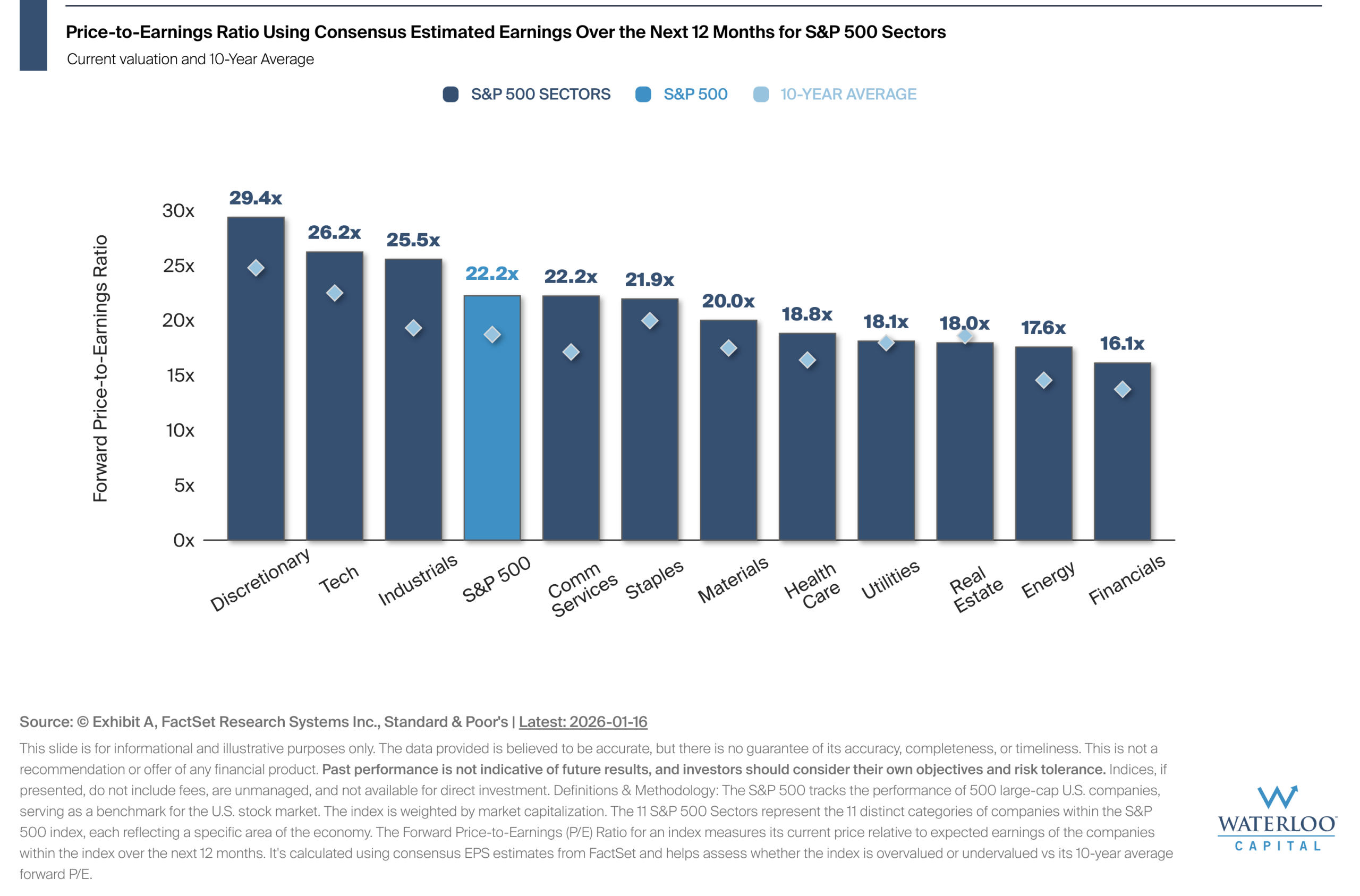
Chart Of the Week – Forward Valuations by Sector
The forward P/E ratio uses consensus estimates for earnings over the next 12 months, providing a snapshot[…]
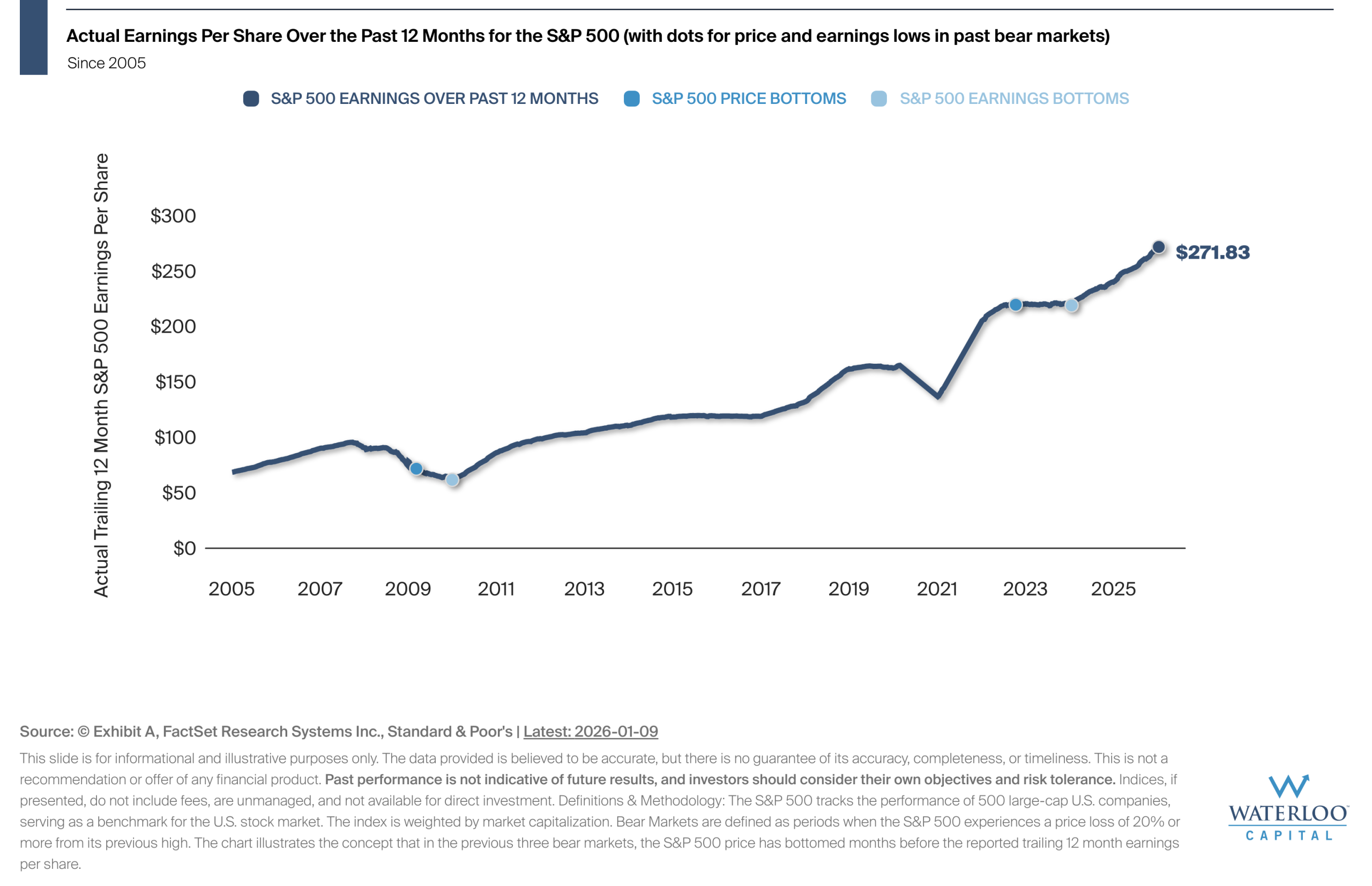
Chart Of the Week – Price Has Bottomed Before Earnings in Bear Markets
While it may feel safer to wait until things "look better", history shows that the market often[…]
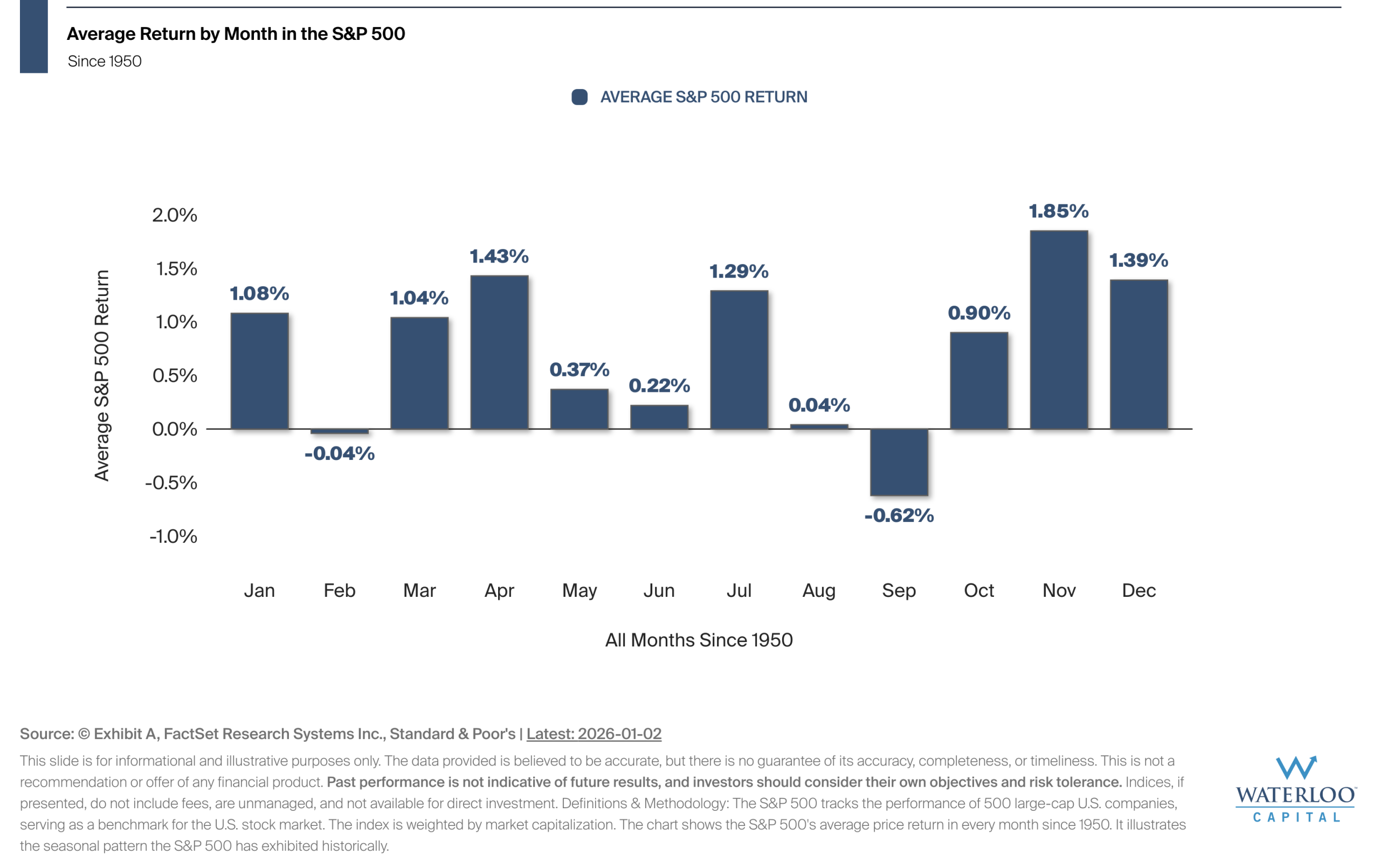
Chart Of the Week – Average Return by Month in the S&P 500
Seasonality refers to recurring trends in market performance during specific times of the year.
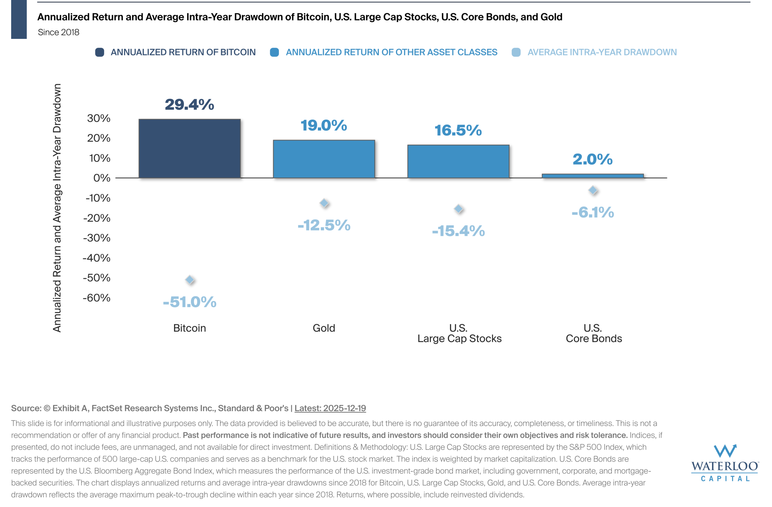
Chart Of the Week – Historically, Bitcoin Returns Have Come With Volatility
This chart puts Bitcoin's performance since 2018 into context by pairing strong returns with the deep drawdowns[…]
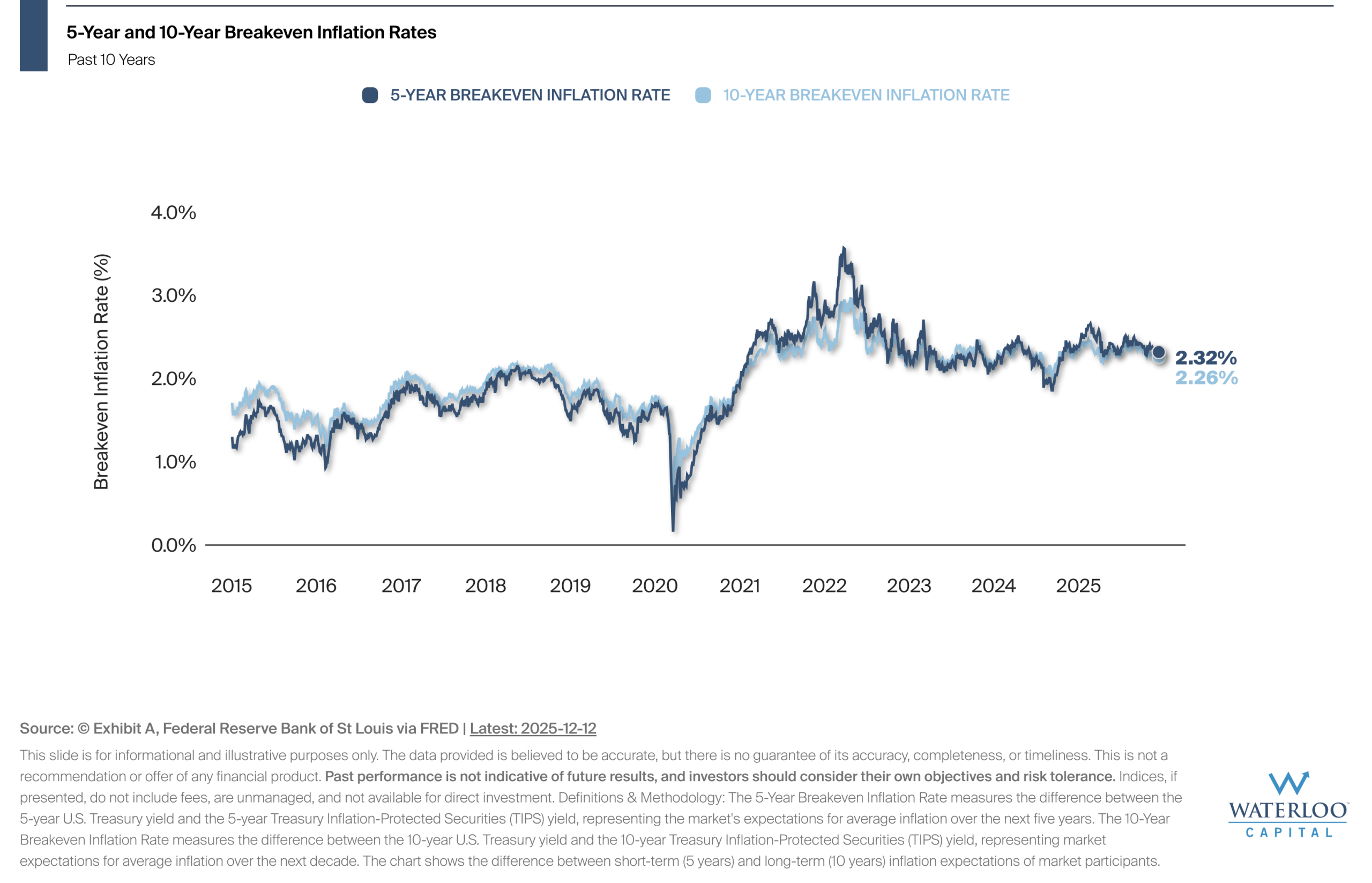
Chart Of the Week – Expected Inflation in the U.S.
The breakeven inflation rate represents the market's expectation for average annual inflation over a specific time-period, calculated[…]
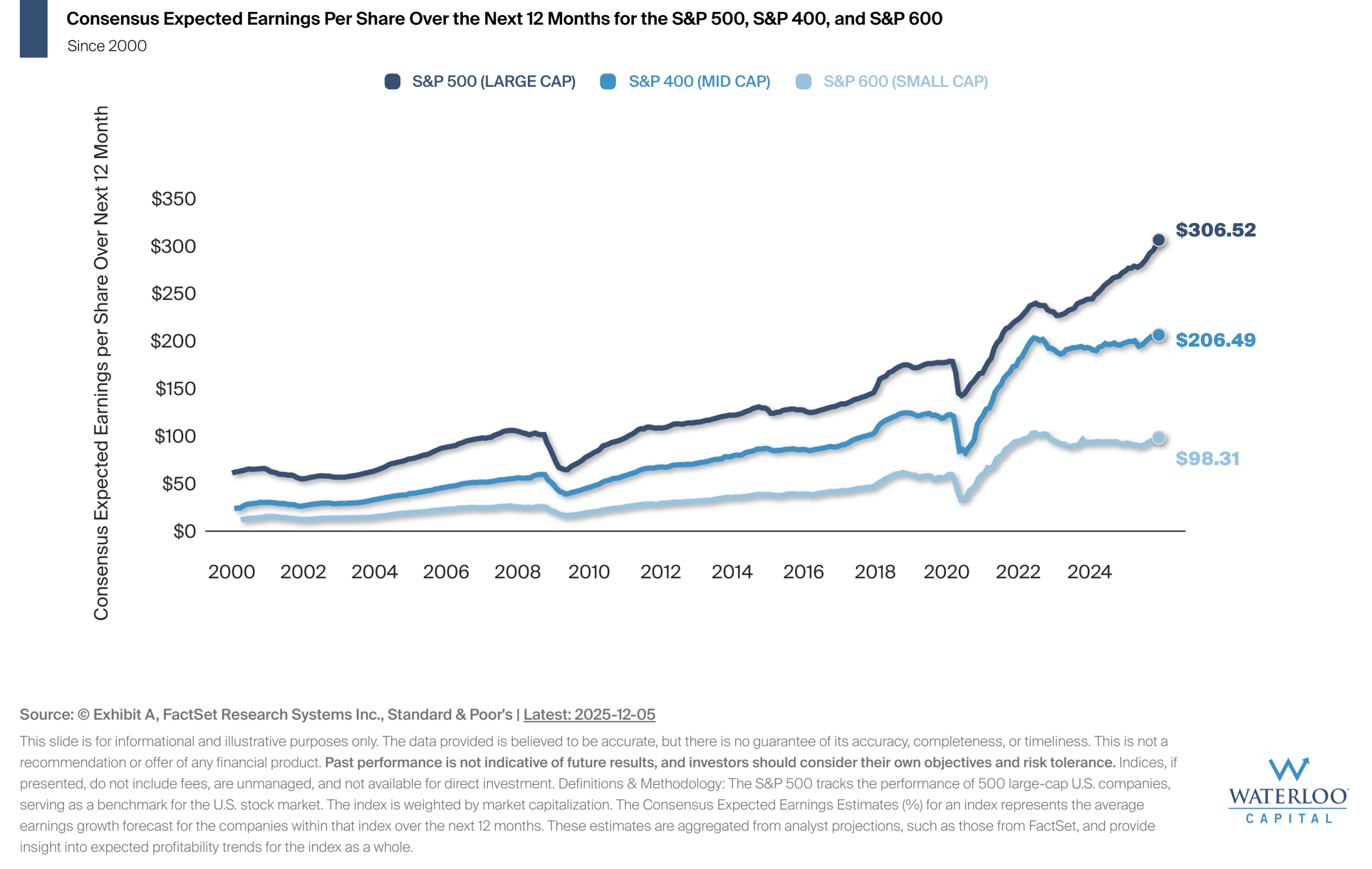
Chart Of the Week – Consensus Expected Earnings Estimates
Forward earnings estimates represent analysts' consensus projections for a company or index's earnings per share (EPS) over[…]
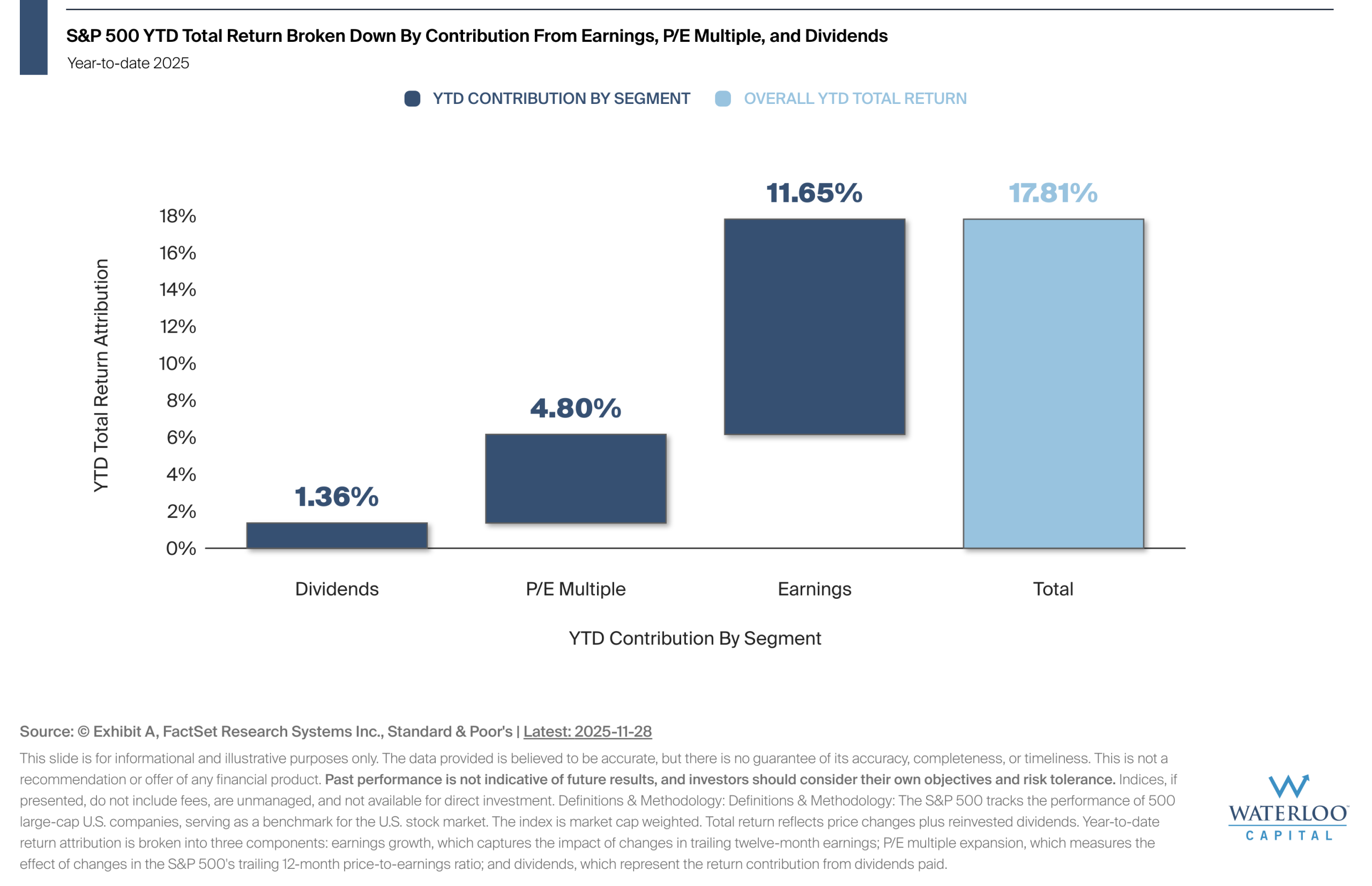
Chart Of the Week – Where Are Equity Returns Coming From In 2025?
The chart shows the S&P 500's total return year-to-date broken down into the contribution from three segments:[…]
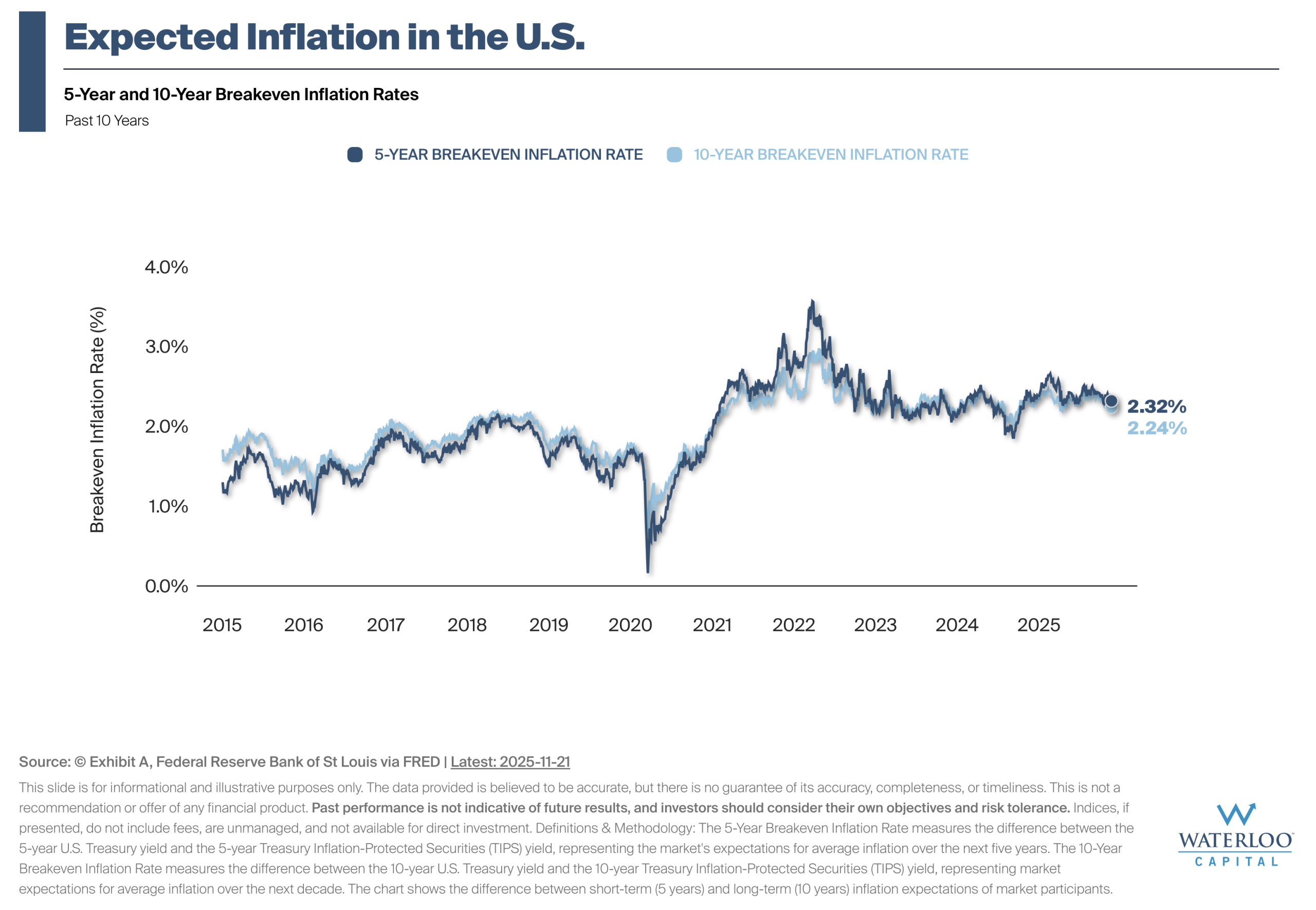
Chart Of the Week – A Peek At Forward Looking Inflation Data
The breakeven inflation rate represents the market's expectation for average annual inflation over a specific time-period, calculated[…]

Chart Of the Week – Gains Increase with Holding Period
S&P 500 data since 1950 demonstrates a clear pattern where extended timeframes have been associated with improved[…]
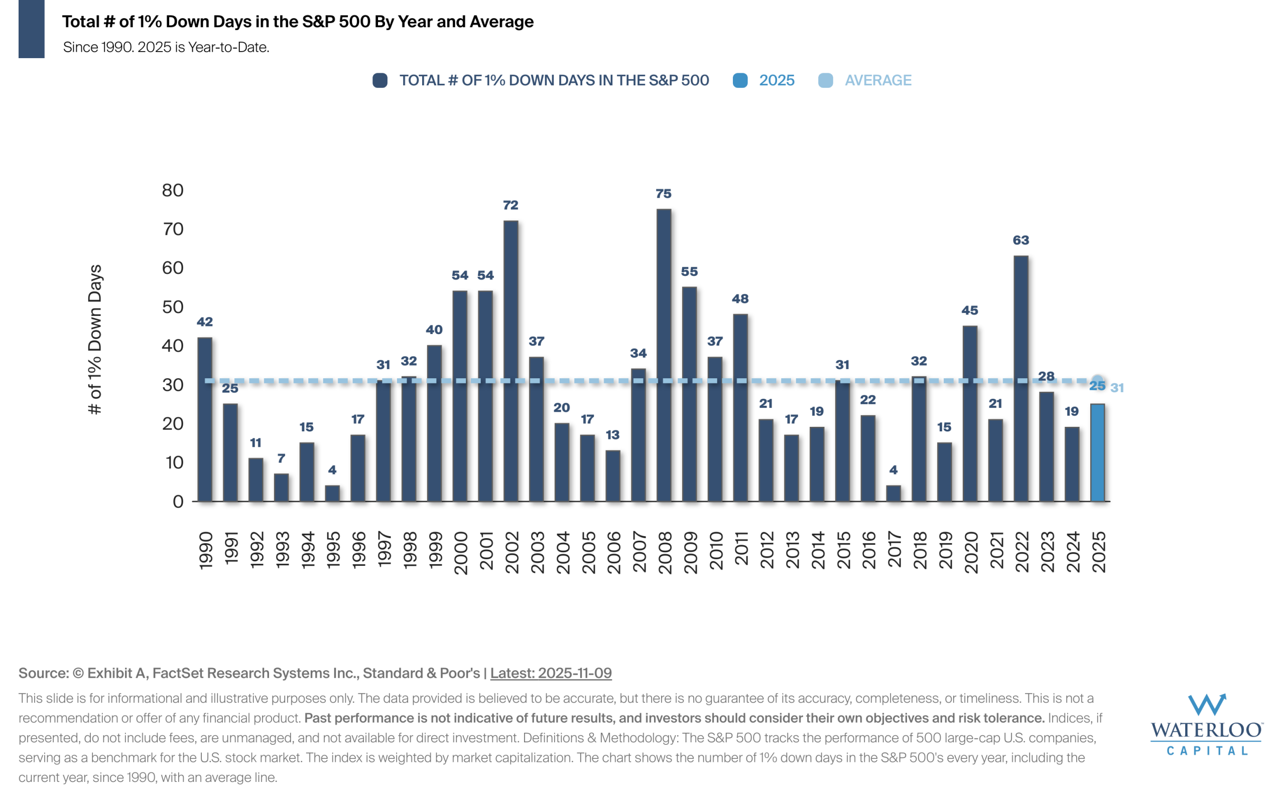
Chart Of the Week – It’s Historically Normal For Large Down Days To Happen
The chart shows that large market declines of 1% or more happen regularly — on average, there[…]
Let’s Connect
©2025. Advisory services offered through Waterloo Capital, LP, An SEC Registered Investment Advisor.