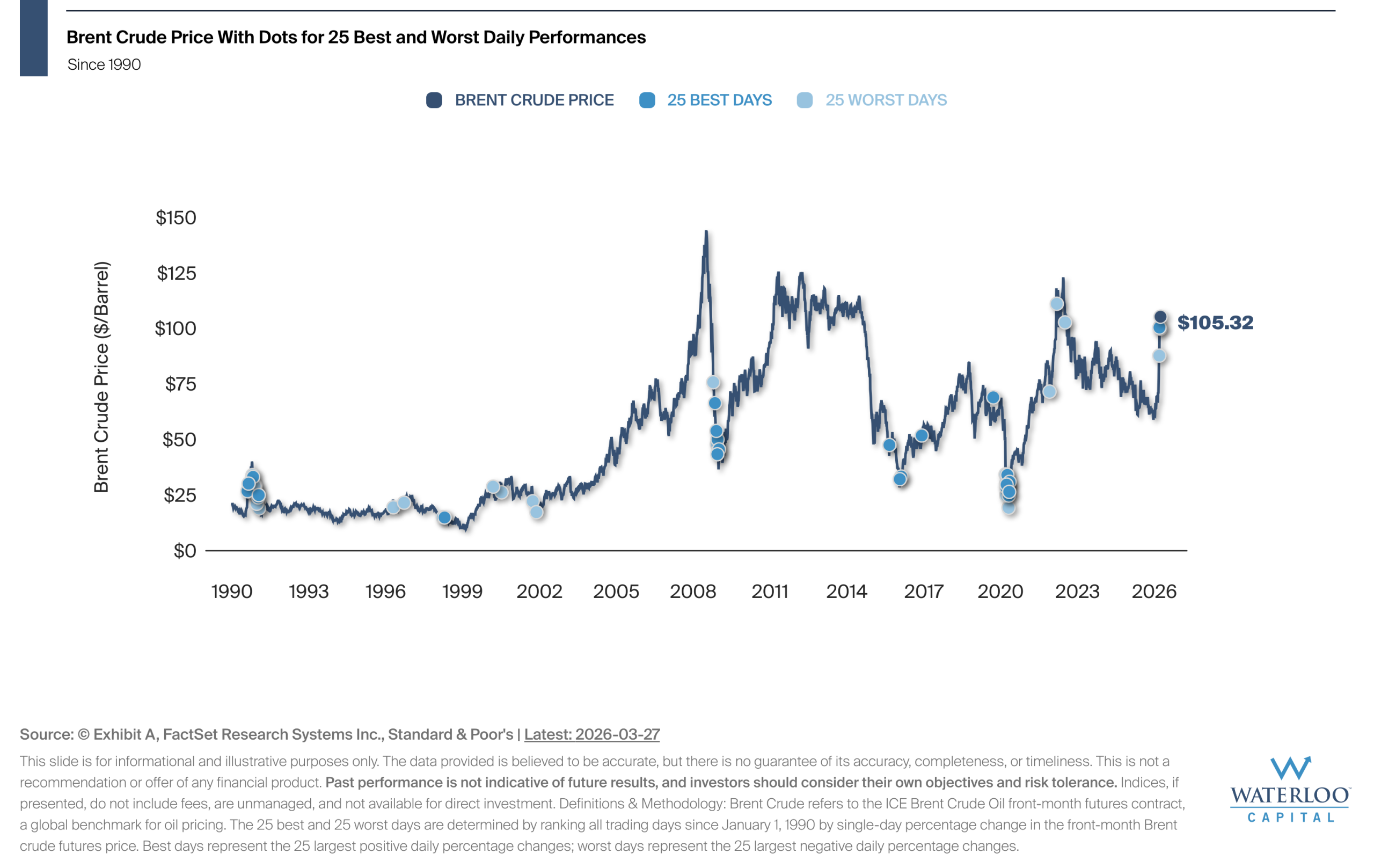
Chart Of the Week – Historically, The Best & Worst Days For Oil Cluster
This chart plots the daily price of Brent crude oil since 1990 and highlights the 25 best and[…]
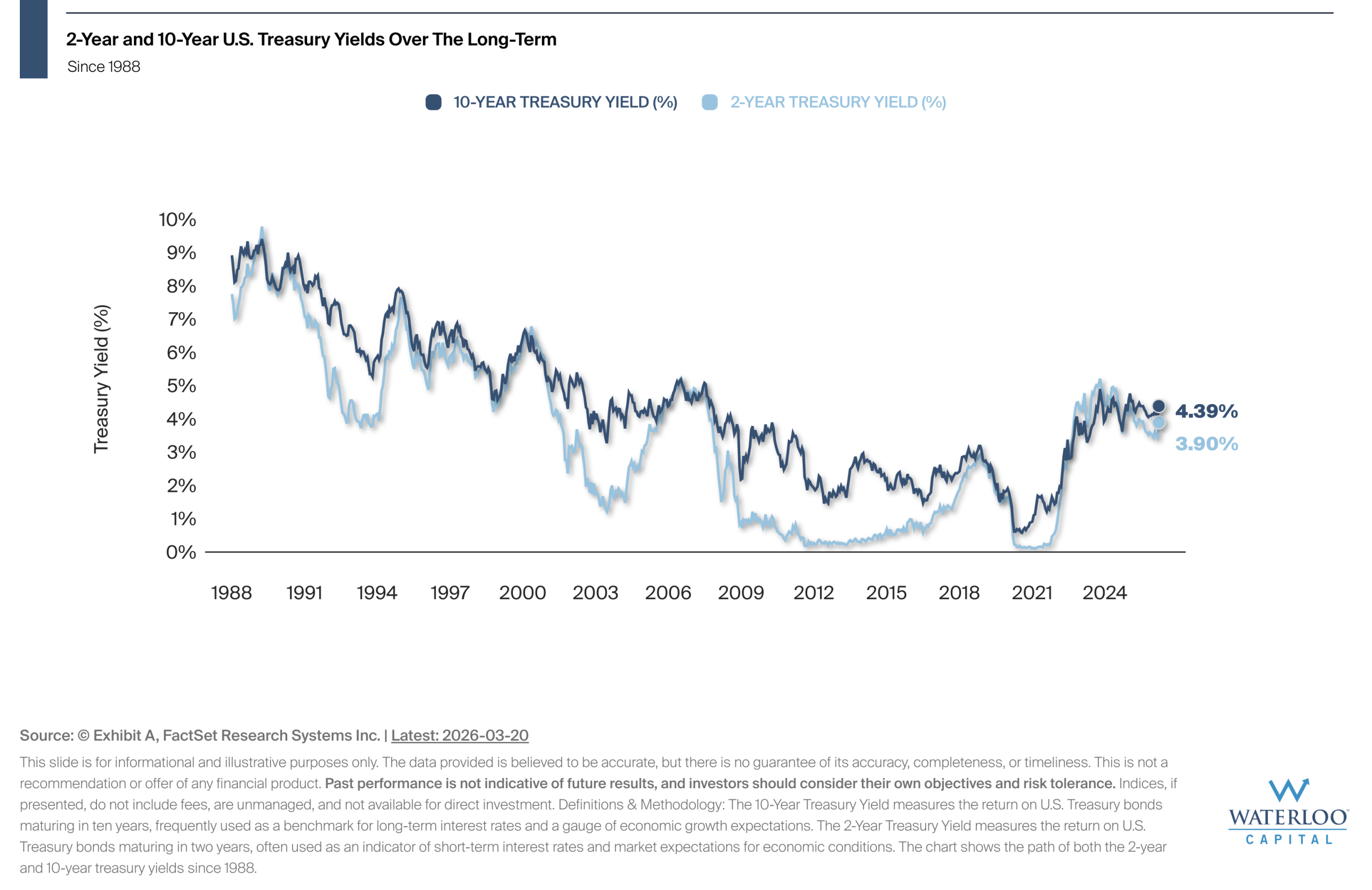
Chart Of the Week – A Long-Term View of US Treasury Yields
The 10-year Treasury yield reflects long-term borrowing costs and investor expectations about economic growth, inflation, and interest[…]
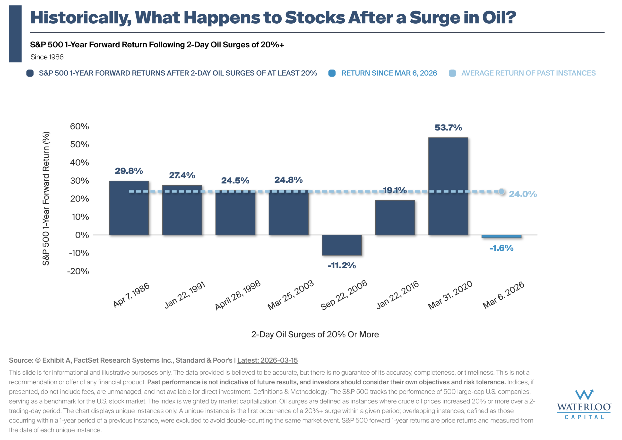
Chart Of the Week – What Happens to Stocks After a Surge in Oil?
The chart illustrates how the S&P 500 has historically performed over the following year after 2-day oil[…]
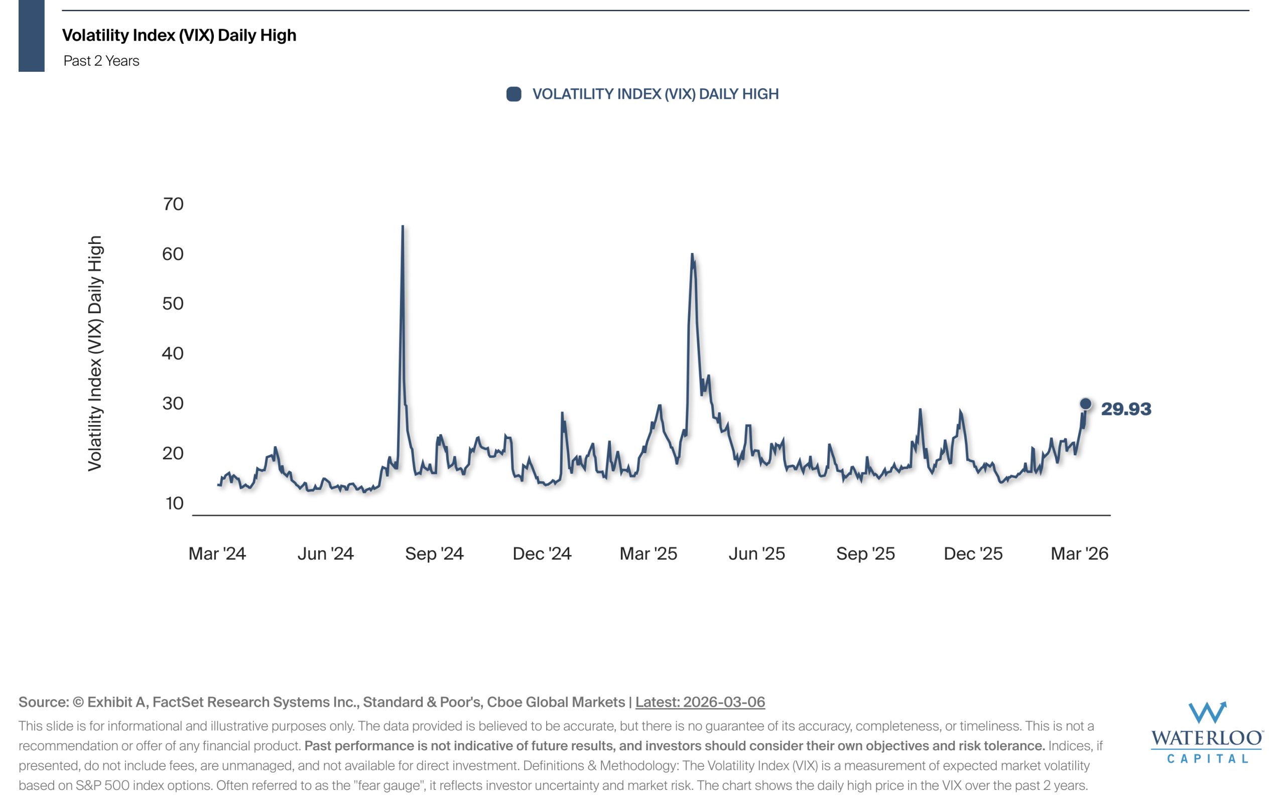
Chart Of the Week – A Short-Term View of Stock Volatility
The Volatility Index (VIX) is a widely used measure of market volatility, often referred to as the[…]
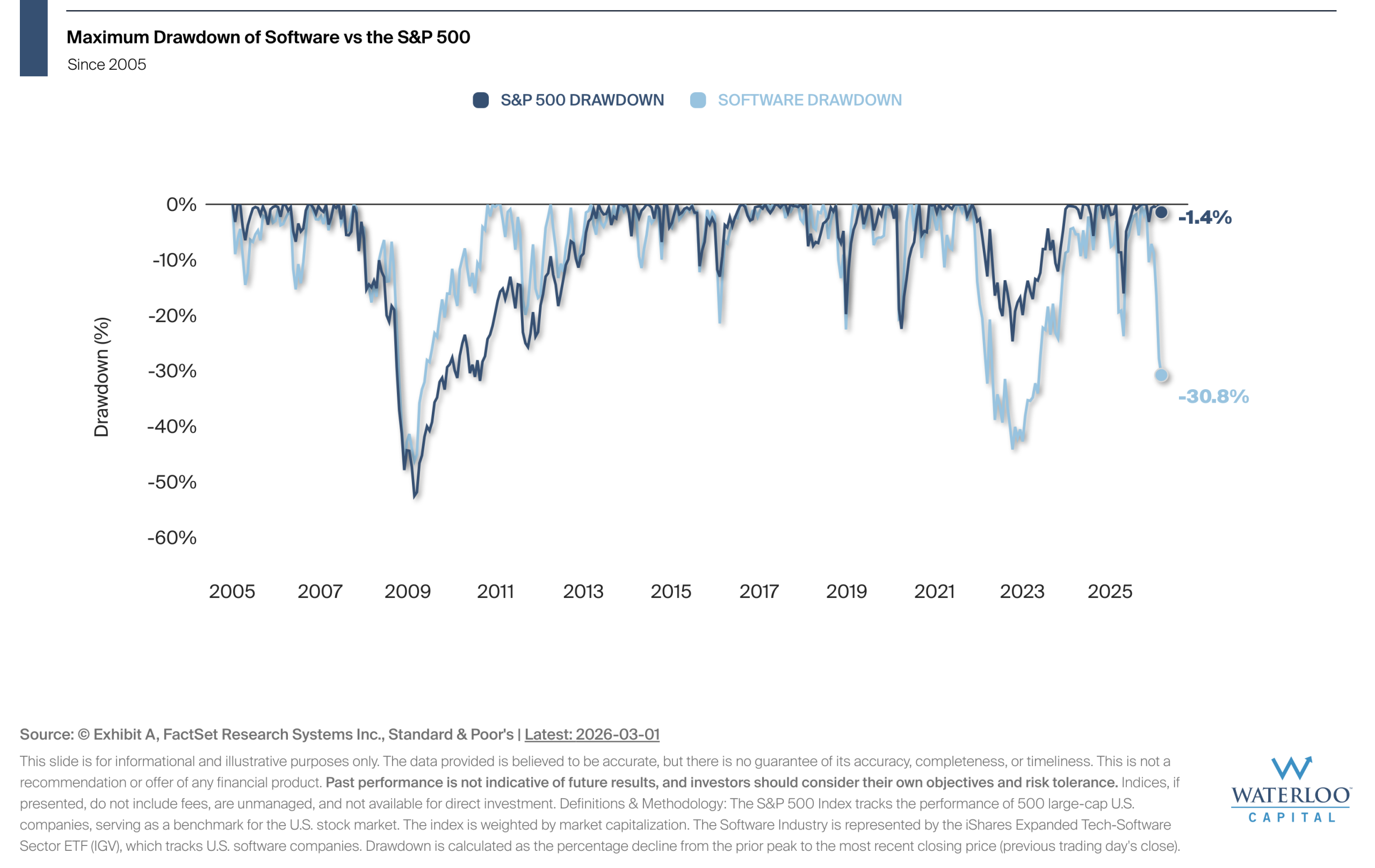
Chart Of the Week – Diversification At Work: Software vs The S&P 500
The chart illustrates the historical difference in drawdowns between the Software Industry and the S&P 500 Index[…]
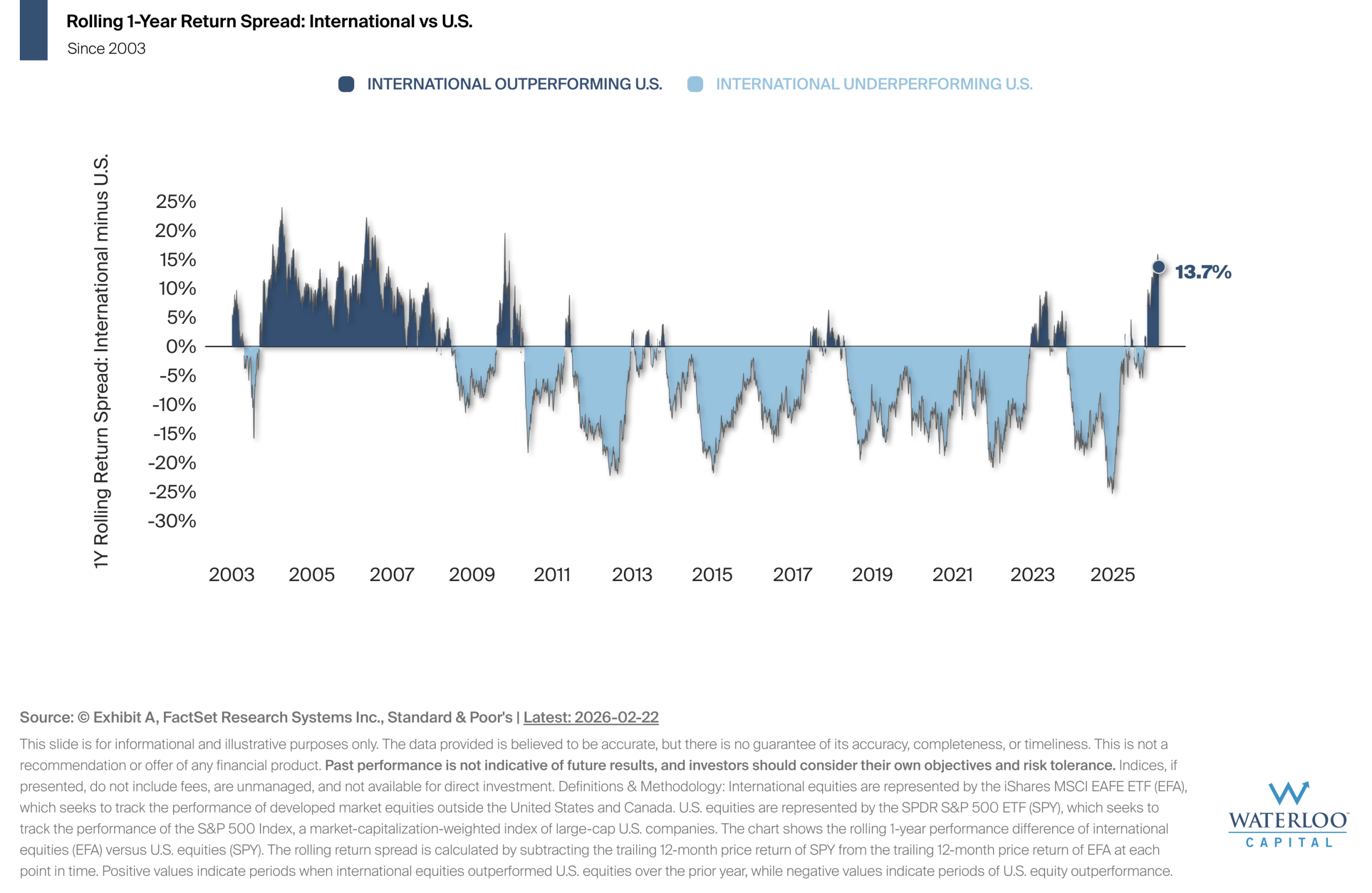
Chart Of the Week – Cycles of International vs U.S. Performance
The chart illustrates the rolling one year performance spread between international and U.S. equities since the early[…]
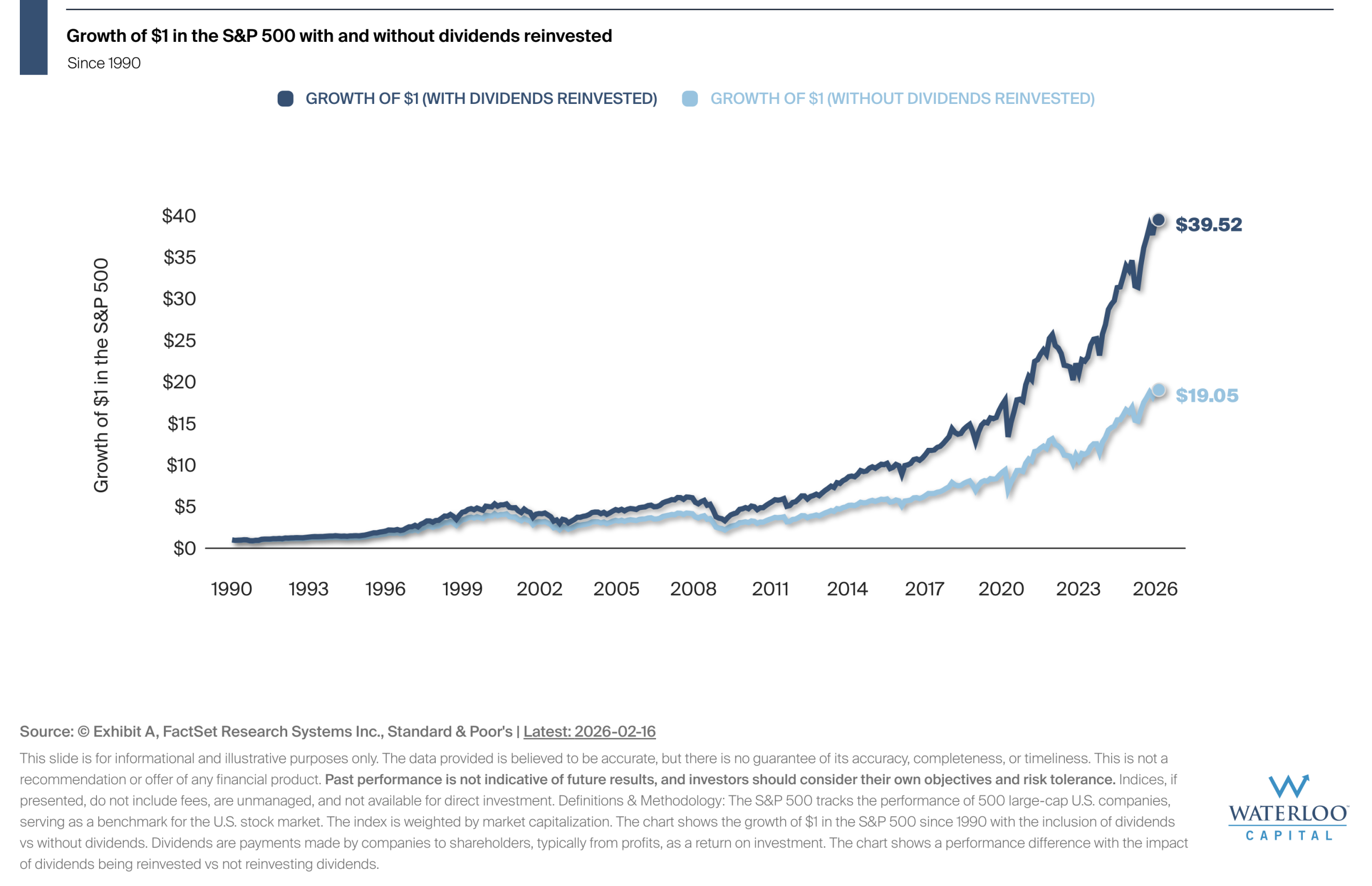
Chart Of the Week – The Importance of Dividends
The chart illustrates the power of dividends in driving long-term growth.
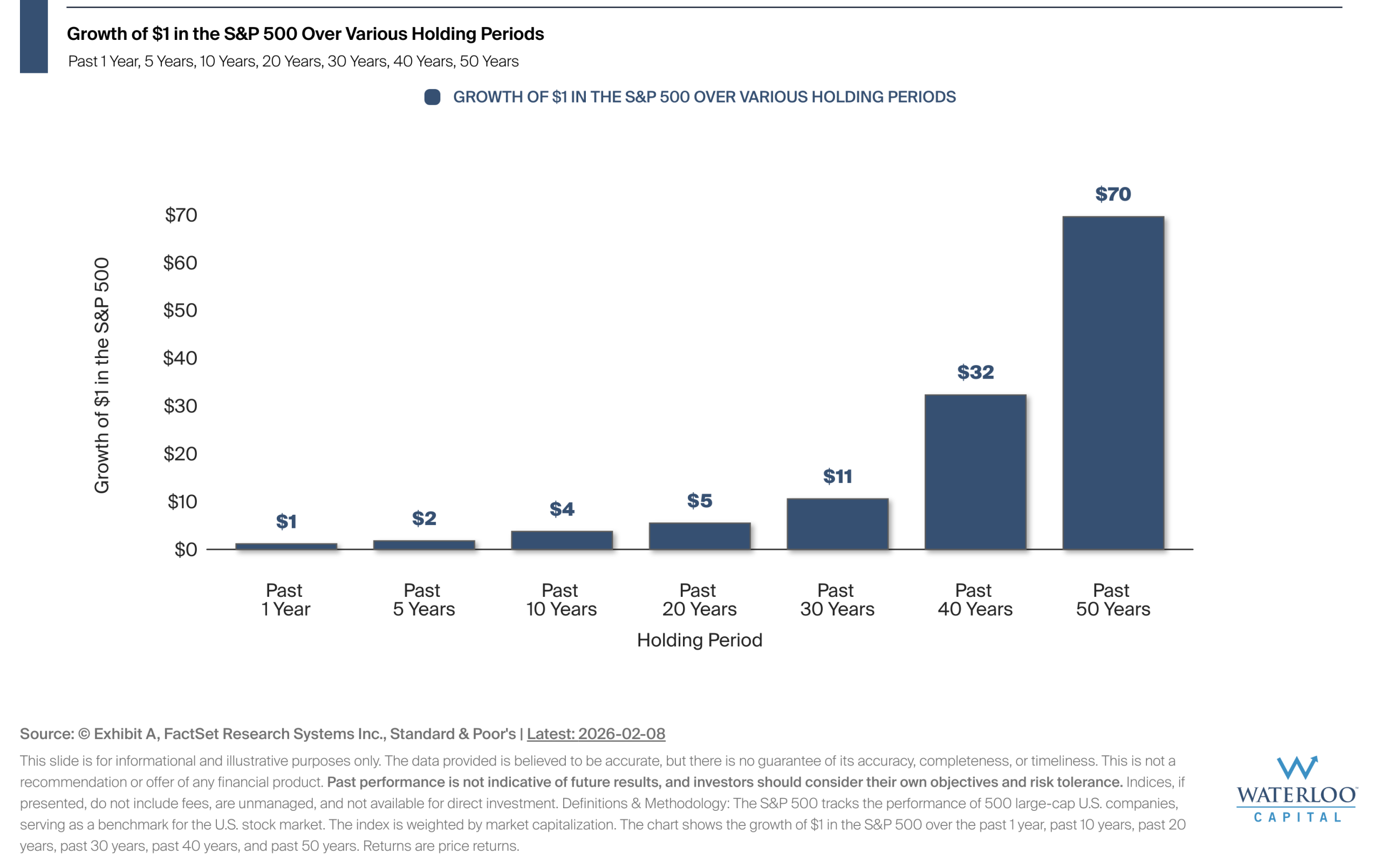
Chart Of the Week – The Impact Time Has Historically Had On Returns
S&P 500 growth patterns show how maintaining investments over decades has historically transformed modest contributions into substantial
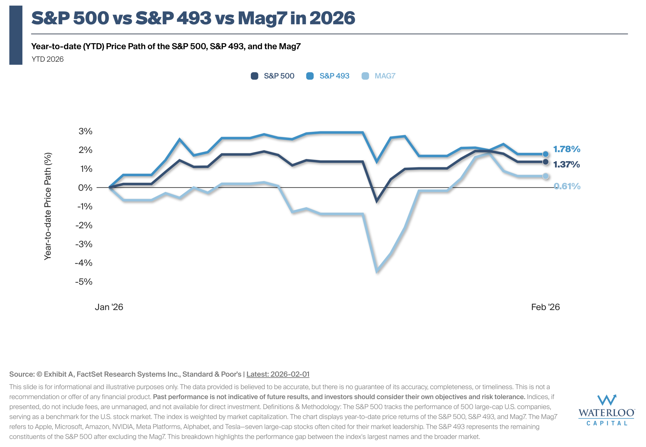
Chart Of the Week – S&P 500 vs S&P 493 vs Mag7 in 2026
The chart shows the year-to-date return paths for the S&P 500, the S&P 493, and the Mag7.
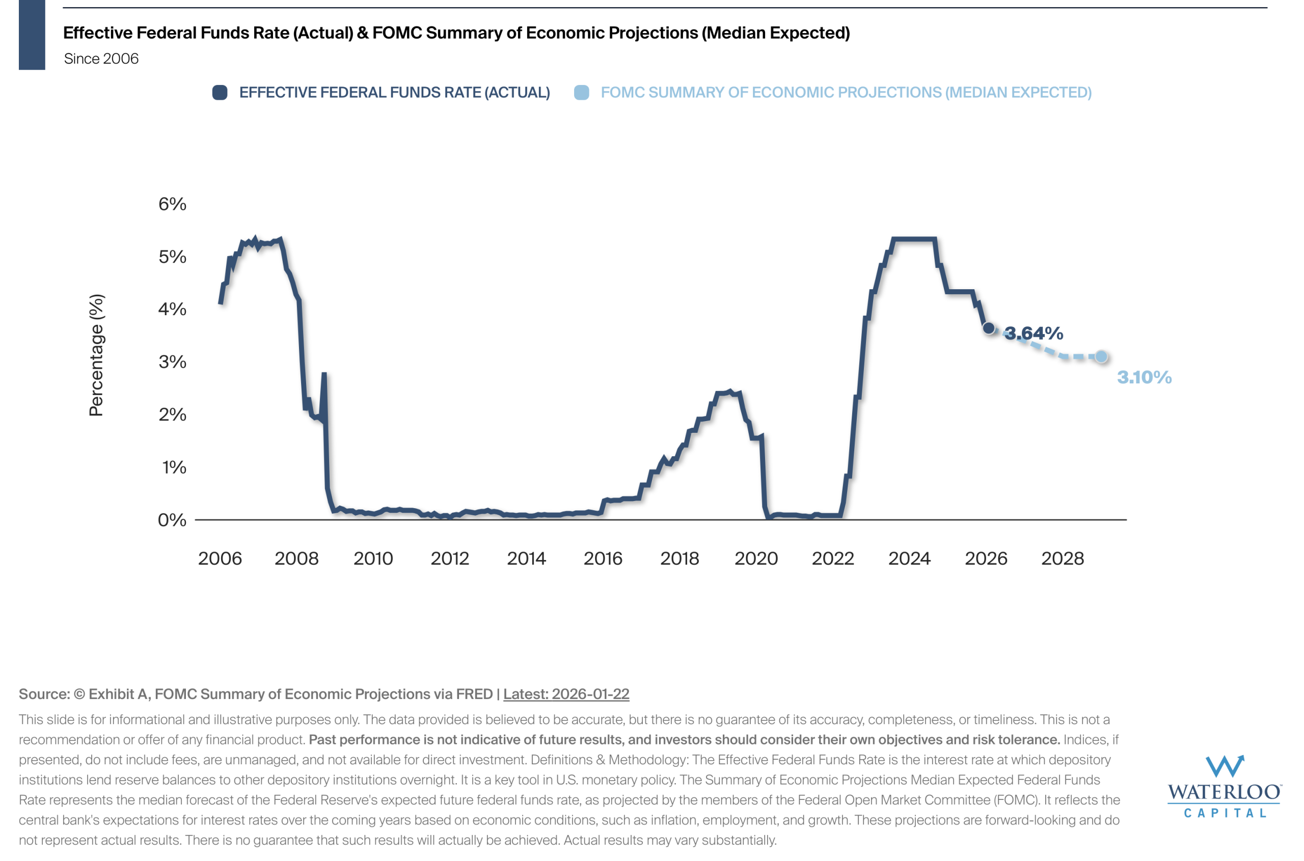
Chart Of the Week – Federal Funds Rate and FOMC Projection
The effective federal funds rate is the interest rate at which depository institutions lend reserve balances to[…]
Let’s Connect
©2025. Advisory services offered through Waterloo Capital, LP, An SEC Registered Investment Advisor.